Project summary
Role: UX Lead
Platforms: Web and Windows app
Responsibilities: UX research, leading monthly meetings with CRM, Customer Support, Business Intelligens, Monetization and Community managers.
Goal: Grow subscription revenue, increase conversion rates, understanding churned users and our offering.


Index
Overview
I assembled a cross-departmental team and took charge of our monthly meetings. The goal was to develop action points for each department, dissecting both quantitative and qualitative data. The aim was to present well-informed insights to leadership, highlighting potential areas for improvement.
Every month, we delved into various KPIs, covering acquisition, revenue, retention rates, and churn rates. Recently, our focus turned to the Premium offering of our platform, prompting the need for a deeper understanding of our data.
Read more about why I felt the need to create a cross-departmental team
Stryda went through several changes in the organisation during the years. After a while I felt somewhat disconnected from other departments that communicated or had contact with our players in other ways than we had in the product teams/UX. So I decided to create our own “user ambassador team” with colleagues from Support, Community, Business Intelligence (BI), Monetization, and Customer Relationship Management (CRM) with the approvement from the CPO.
The team met once a month and shared user-related data and feedback connected to the monthly KPIs. When there were bigger questions regarding data or our hypotheses, we made sure to gather all our findings and insights to triangulate our research or find the best approach to understanding data or discovering more about our players’ behavior.
Understanding data
Our primary objective was to boost our Premium subscription metrics. Given our model where users choose between free and Premium, it posed a unique challenge.
We started to look into:
- The motivations behind users opting for Premium.
- The satisfaction levels of our Premium subscribers.
- The most appealing benefits within our Premium offerings.
- What the most popular offerings in the Premium features were.
- The reasons prompting users to cancel their subscriptions.
The first task I received from a user experience standpoint was to create a survey and send it out to everyone engaging with the platform to identify the top reasons for opting into Premium and to understand the most appreciated aspects of the Premium offering.
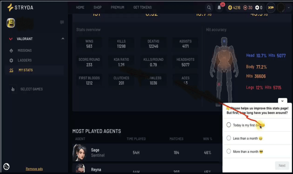
Hotjar survey
I utilized Hotjar, our go-to tool for swiftly deploying surveys on different parts of the platform. To maximize responses globally, we aimed to make the survey accessible to everyone, regardless of the platform section they were browsing.
Statistical significance
In this case, we sought as many respondents as possible but capped it at 2500 users, considering the need to analyze open-ended questions.
We aimed to filter responses based on users who were already Premium, those who found our offering interesting, and those who did not find it interesting at all. Another filter we wanted to use was by country to be able to see what our core market would answer.
Benchmarking
To comprehend the scores, we needed to establish what constituted a good or bad number. Thus, we examined other companies employing a freemium and premium subscription model to observe how many users remained as freemium users compared to premium users.
Upon analyzing the data, we realized that our numbers was similar to that of other companies. We were not alone in grappling with our premium offering, especially with using a freemium pricing model supported by ads, such as Spotify.
Results
The survey responses reflected varied opinions on the Premium features and benefits. Some users desired additional features without additional payment, while others found the existing offerings satisfactory. Concerns regarding the high cost of Premium were prevalent, with many suggesting more affordable options. Key findings also included requests for specific features and a preference for free coins or skins. Our next steps involved evaluating the feasibility of user suggestions, reviewing the pricing model, and addressing affordability concerns.
Next steps
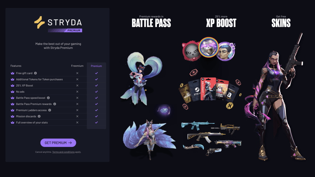
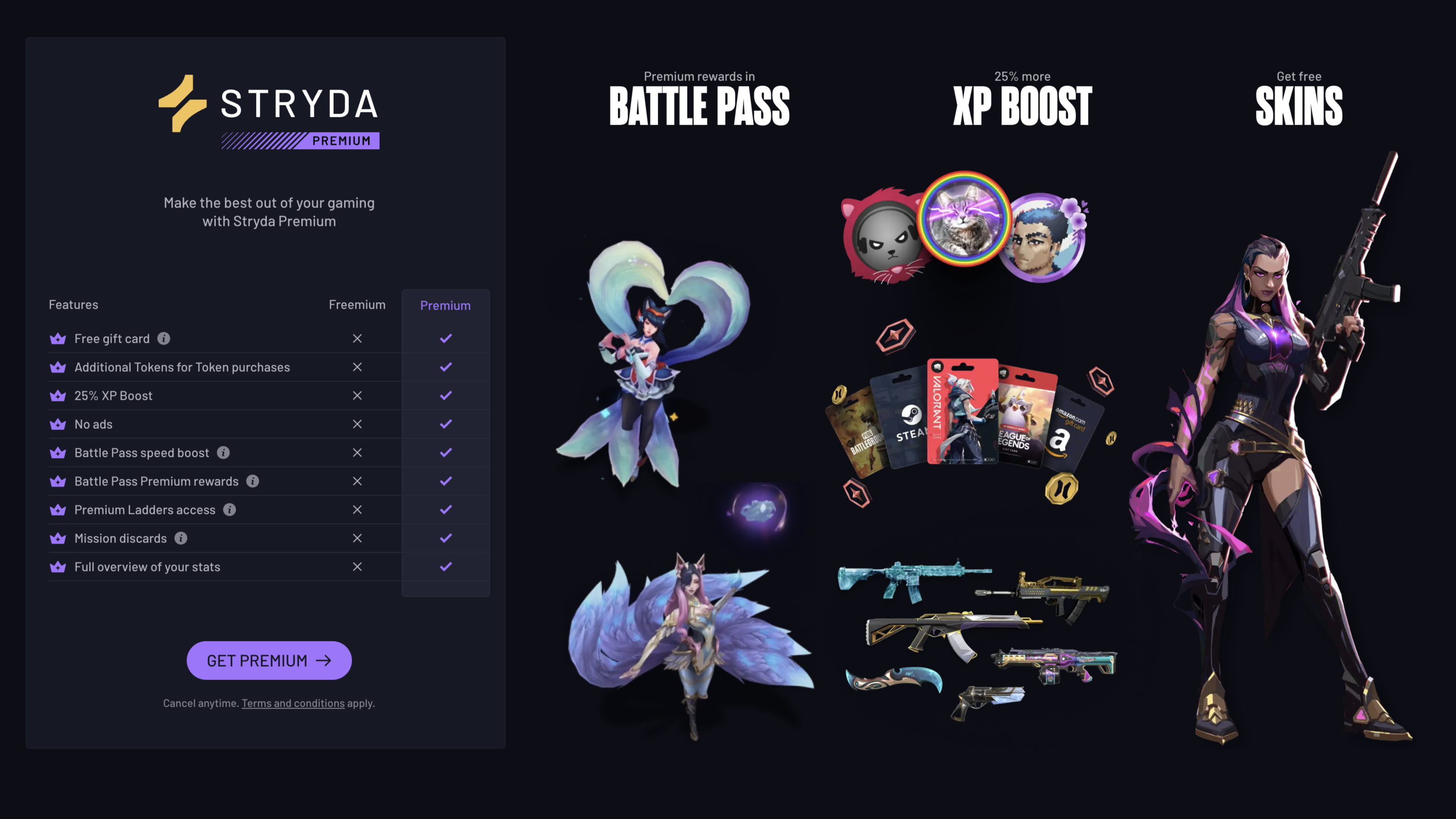
Our next steps were to look into potential improvements for what we already had. We decided to redesign the Premium page to:
- Highlight the most popular parts of our existing offerings, now that we had the answers to why users decided to pay for premium.
- Make it clearer what was included in freemium and premium (fast comparison)
- Be more straightforward by having the most important parts above the fold.
- Using images to highlight the offerings visually.
We then looked into which countries thought the Premium offering was too expensive but realized that it was not dependent on which country users were from; the pricing model was still too expensive, even for our core markets. The next steps would be to look into the pricing models.
During this time, we were also working on the new platform and started to ideate on what parts could be part of the premium subscription to add more value to the users based on input from this survey.
We also noticed some contradictory data on some of the premium features that were in the top reasons for getting premium. Our data showed premium users still did not participate in those features, so we had to understand why in upcoming research.
We also did not get enough answers from users who were already subscribers or had previously been subscribers. So our next step was to target our subscribers only about the premium offering by sending out emails and content cards through our CRM-tool customer.io to understand why they decide to cancel or keep their subscription.
This was one example of how we worked together to understand data and how we collaborated to define pain points and action points. These were then presented to leadership for further consideration based on business requirements as well.
