Summary
Role: UX Lead, UI Designer and visual designer
Platforms: Web (responsive)
Responsibilities: Translating requirements into user stories, creating a style guide for Utbildningsguiden based on Skolverket’s existing brand guide, wireframes and high-fidelity protoype, conduct usability testing, user interviews and communicating designs to leadership and team. Also created images, illustrations or photos, to be used as content.
Goal: Skolverket received a government assignment to consolidate all school and education data from four different sites into a unified platform aimed at guiding the Swedish people on their educational paths, with a focus on accessibility and inclusive design.

Index
Overview
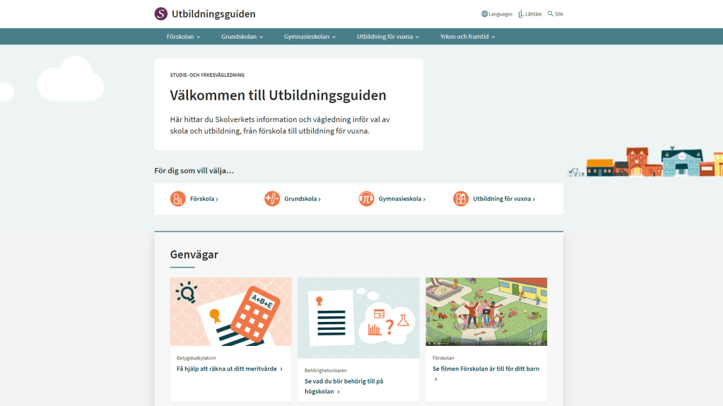
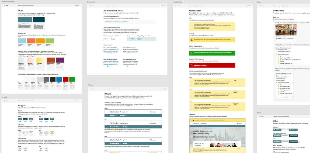
As UX Lead, I not only contributed to the development of the educational guidance platform “https://utbildningsguiden.skolverket.se/” but also played a key role in shaping its identity. I facilitated a workshop involving project stakeholders responsible for information, where we collectively defined the tone-of-voice, the name of the site and the desired user experience when exploring Utbildningsguiden. I integrated Skolverket’s design system and created a secondary style guide tailored specifically for Utbildningsguiden.
The platform, powered by Sitevision as the Content Management System (CMS), underwent regular accessibility checks using Siteimprove to ensure adherence to WCAG 2.1 standards. I played a pivotal role in organizing impactful workshops, including an impact mapping session with a colleague from Knowit, followed by continued independent facilitation of workshops incorporating design studios.
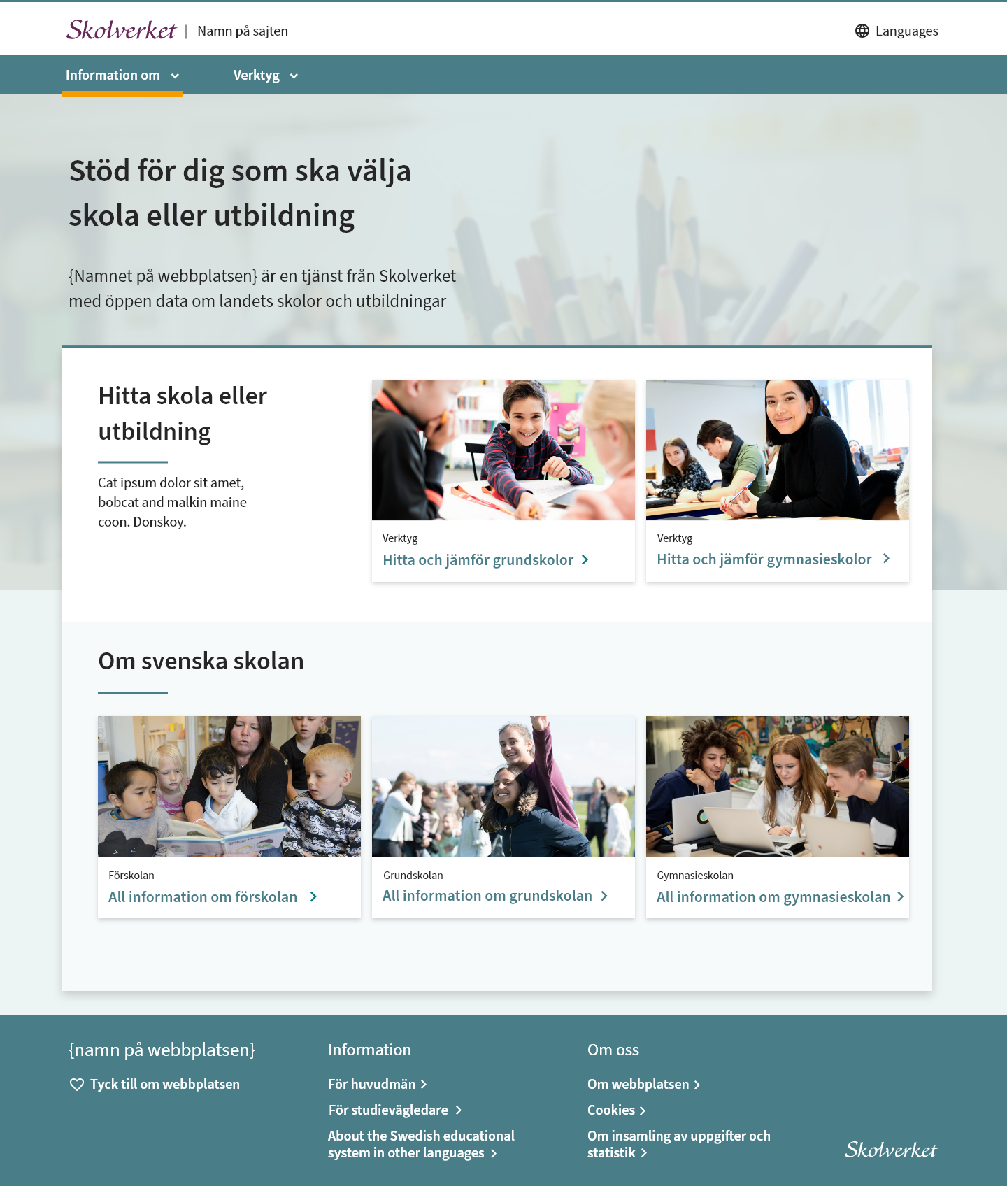
Our collaborative efforts resulted in the creation of Utbildningsguiden and the essential tools, such as “Hitta och jämför grundskolor,” “Hitta och jämför gymnasieskolor,” “Hitta och jämför vuxenutbildning,” and “Behörighetsvisaren.” These tools, each thoroughly designed, serve distinct purposes outlined by Utbildningsguiden.
In September 2018, we received approval and praise from the government and the Minister of Education after showcasing the MVP of Utbildningsguiden. Subsequently, we continued to develop and enhance the platform.
Defining the platform
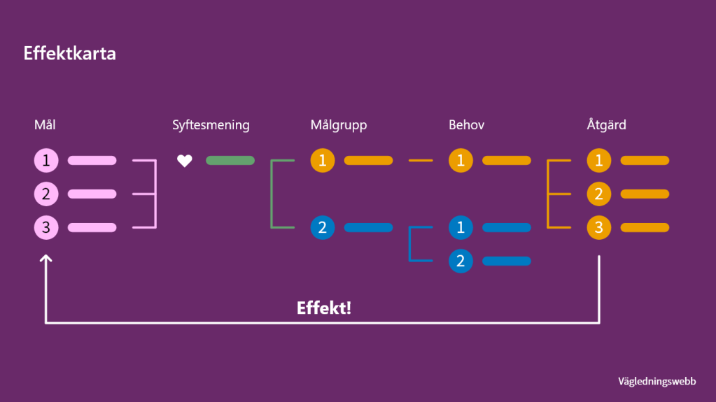
Impact mapping
To align the goal and the necessary tasks for building the educational platform, we invited all stakeholders at Skolverket to collaborate on creating a map. This map connected all the target groups, needs, and tasks to the various goals outlined in the government regulations that we needed to fulfill.
Aligning design and tone-of-voice
After the impact mapping we had to decide upon the name of the site, the tone-of-voice and design. This time, I invited all stakeholders interested in the platform’s design to an art direction workshop to understand their preferences for look-and-feel and the desired perception of the platform.
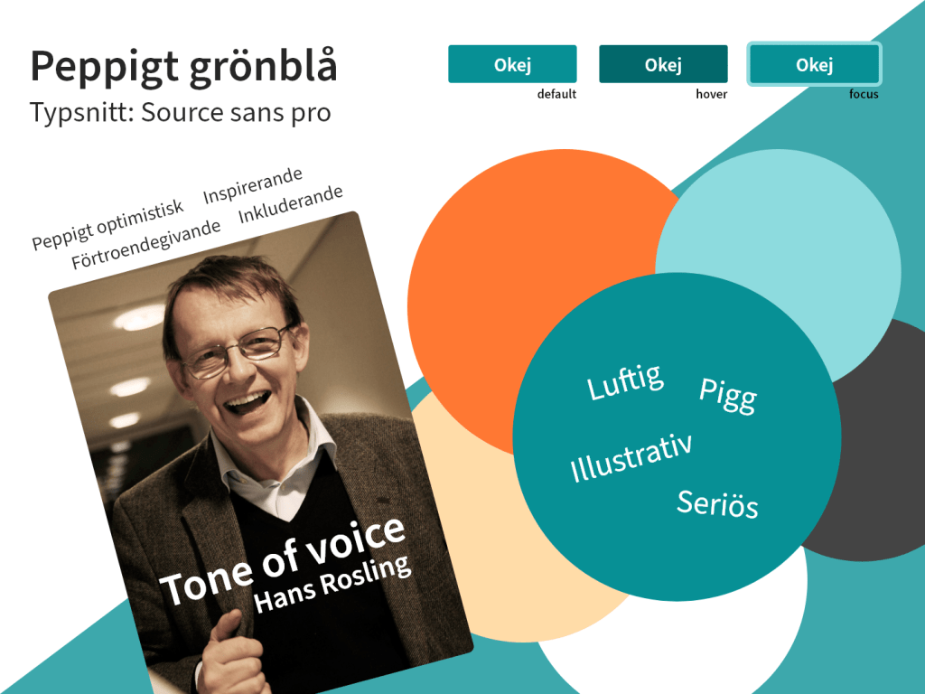
However, despite the valuable insights gathered from the workshop, which included all Skolverket stakeholders, we faced a challenge. We couldn’t proceed with the desired concept due to strict rules allowing only the use of existing colors from Skolverket’s graphical guide, a policy established after the workshop. To maintain alignment with the workshop’s ideas and swiftly implement changes close to our deadline, I sought colors that closely matched the initial design concept. The result is what is live today.
Case: Behörighetsvisaren
During the implementation of the various websites, we also aimed to enhance different tools that were not meeting accessibility standards, one of them being Behörighetsvisaren—an instrument for comprehending and comparing different educational programs within the gymnasiet (Swedish high school). The tool was utilized by students (15-16 years old), parents/guardians, and school counselors.
Design studios
To gather ideas, I facilitated a design studio with over 30 counselors from across Sweden to obtain their input on what they considered crucial to retain, discard, and add in the future iteration of Behörighetsvisaren.
The challenge with the previous Behörighetsvisaren was that it was challenging to understand from a student or guardian perspective, while school counselors used it without difficulties.

Armed with this input, I proceeded to facilitate a design studio at Skolverket, where I invited developers, stakeholders, editors, and students to participate.
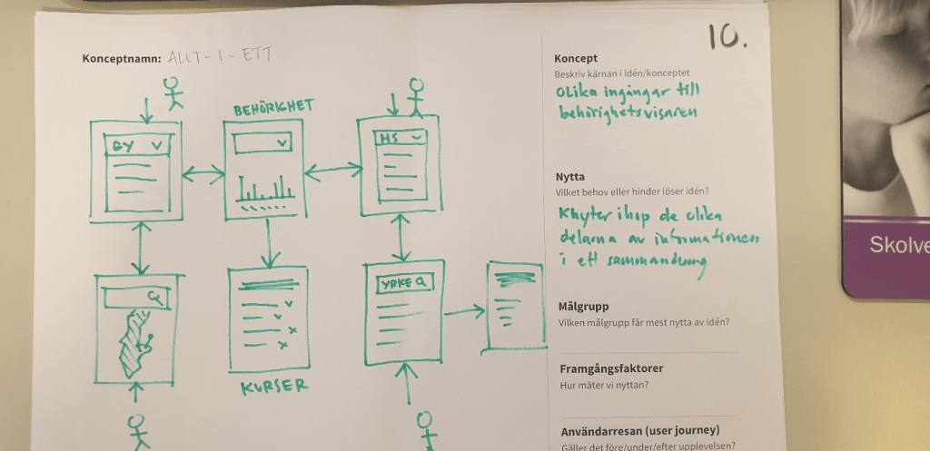
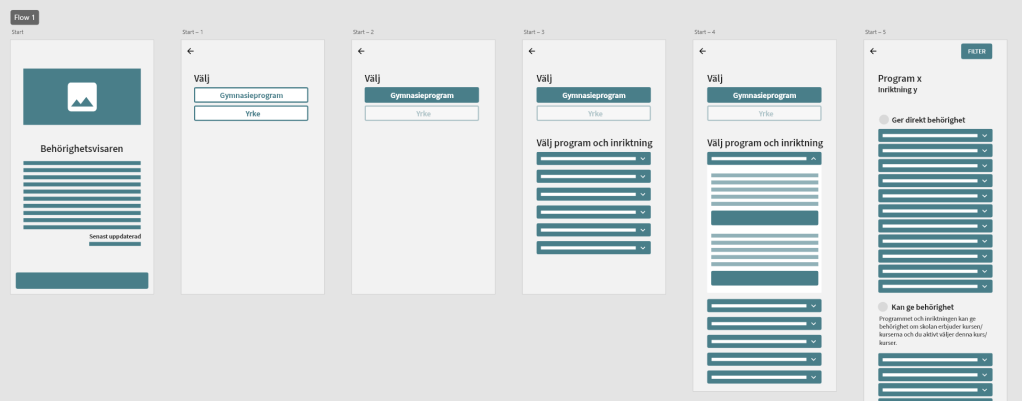
The majority of conceptual ideas suggested beginning by selecting a profession, sometimes in combination with a high school program. Most also outlined the idea of obtaining an overview of required courses and qualifications. Using colors (green, yellow, red) and/or percentages, users could assess how well they met the eligibility requirements based on the selected program.
When I began working on Behörighetsvisaren, we realized the urgency of delivering the updated tool within a couple of weeks. Another challenge for the new Behörighetsvisaren was that we could only use components from the Design system due to a tight deadline and no time to research other solutions or third-party tech that complied with open-source principles and followed GDPR (another requirement for being an authority).
We assumed that students and parents use their phones daily for research. Therefore, we focused on designing the new Behörighetsvisaren with a mobile-first approach, while still ensuring responsiveness as it would be part of the Utbildningsguiden website.
Testing Behörighetsvisaren

I conducted usability testing and interviews with students, guardians, and counselors to evaluate the new flows and design of Behörighetsvisaren.
The identified themes and improvements found during the interviews and remote testing highlighted key areas for enhancement in Behörighetsvisaren, focusing on improving clarity, user understanding, and navigation. Additionally, positive feedback highlighted successful changes, including a modern layout, increased information coverage, improved user-friendliness, expanded behörighet details, and effective incorporation of visual elements.
With this in mind, we compiled a list of feedback for future iterations that could be explored.
Results
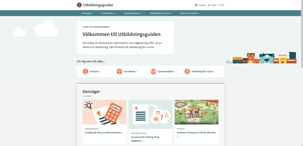
Here is a comparison of what I created as a wireframe early in the project and a mockup several months later when all four websites were merged into one, and all information was in place.
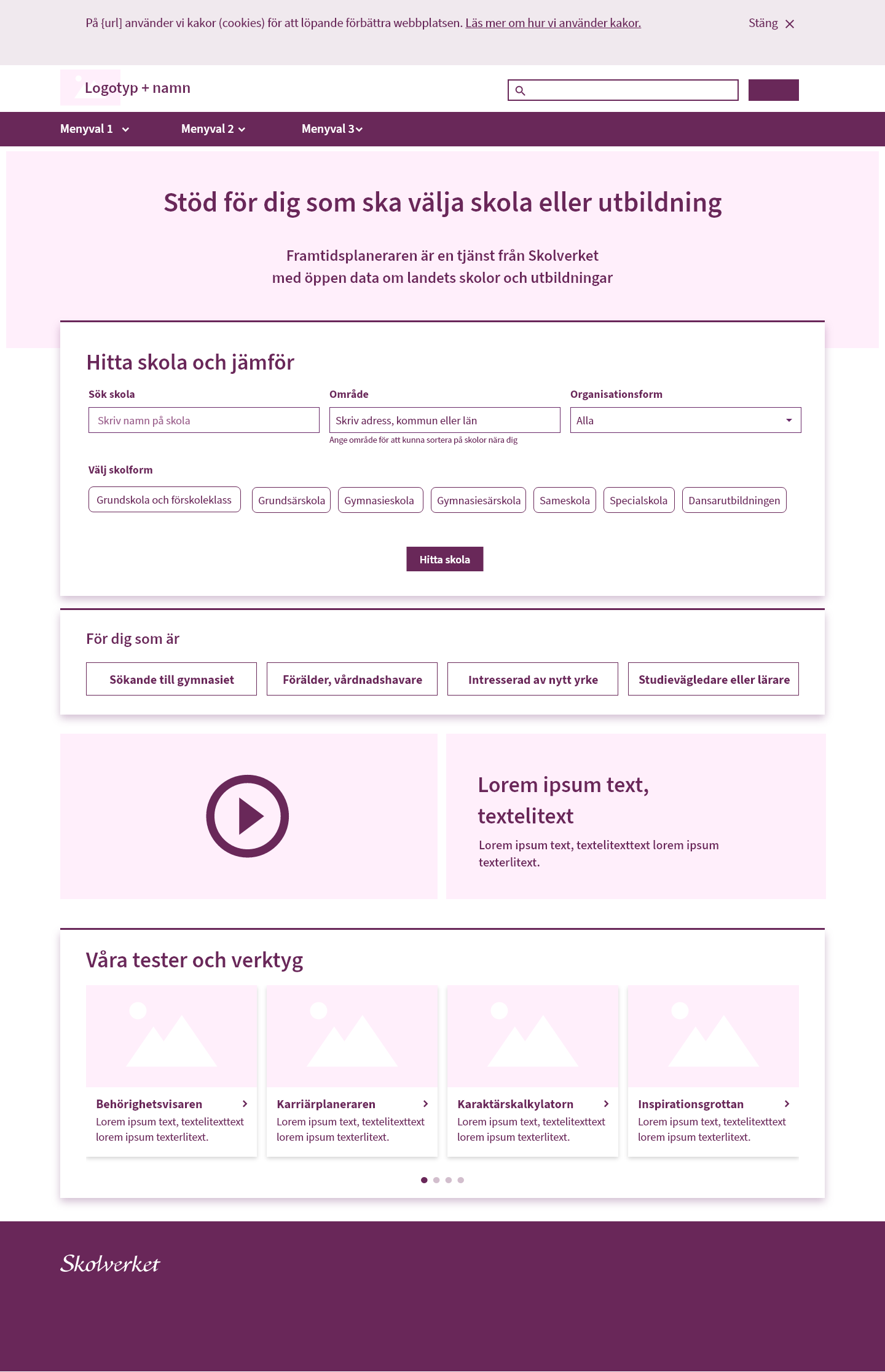
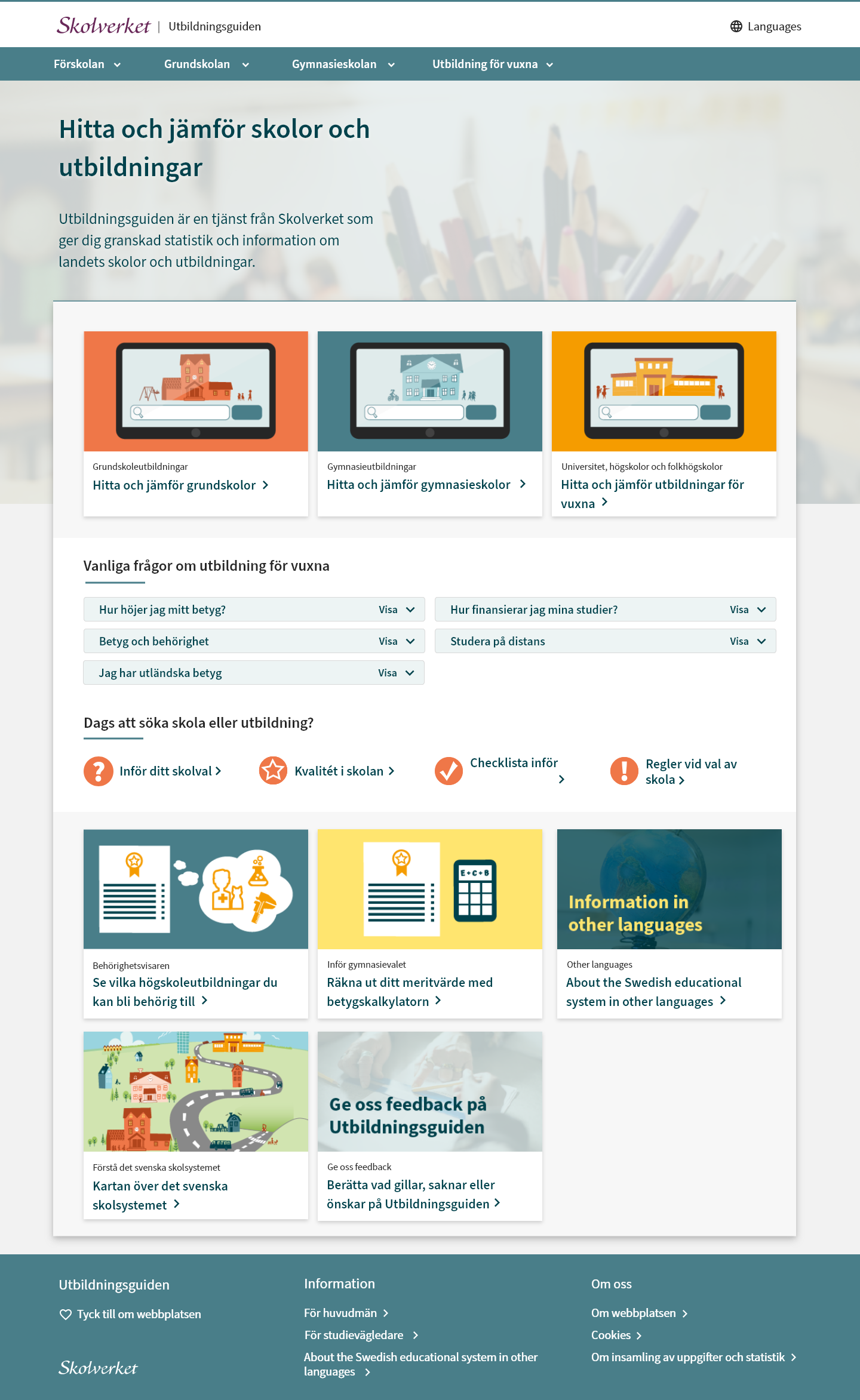
Utbildningsguiden is still live today with most of my work still being in place. Some parts have gone through some improvements as it should, as the website now is soon to be 4 years old.
Learnings
It was a challenging time in the beginning of the project, aligning the task at hand with everyone. Stakeholders from different departments couldn’t agree on what to prioritize in different areas, while we simultaneously had a very tight deadline to create a whole new website in just a couple of months (during summer, and people were away on vacation). Despite all the challenges that emerged, I was really proud of what we achieved, especially after receiving praise from the ministers in government.
My product owner from Skolverket was also initially new to the whole PO role, but in the end, we had an amazing workflow together with the team and our Scrum-master. We could eventually focus on delivering MVPs and being able to improve areas as we went on.
It was also a struggle to gain buy-in for conducting usability tests and interviews, but we managed to do so eventually (even if it was a bit too late in the process, with the majority of the website already in place). Additionally, the UX maturity was a bit low in different areas, and it was sometimes hard to present insights where some people took it as criticism instead of possibilities for improvements.
I learned ways to handle different types of personalities during this time, and after a while, they could see the benefits of testing early and including the people who are potentially going to use their services and websites. To me, that was a win when I eventually left Skolverket and stopped working as a consultant.
TL;DR
- Managed challenges in stakeholder alignment, tight deadlines, and prioritization issues, ultimately achieving a successful release of Utbildningsguiden.
- Overcame struggles in gaining buy-in for usability tests and interviews, highlighting the importance of involving end-users early in the process.
- Adapted to the low UX maturity in certain areas and learned to present insights as opportunities for improvement rather than criticism.
- Developed effective strategies for handling different personalities at Skolverket, contributing to a positive workflow and successful collaboration.
- Emphasized the significance of early testing and user involvement to stakeholders, resulting in a positive shift in perspective.
